
Purina
Background
Purina came to us with an idea which was to develop a feeding tool that helped their customers understand how much they should be feeding their pets based on individual characteristics and needs.
Whilst there was an array of articles surrounding the subject of feeding your pet on the Purina site it was clear from online survey feedback, bounce rate and search insights that the content currently being communicated was not useful to the customer. This is where I step in.
Challenge
After conducting some initial research to understand the project, we found that one of the major challenges in developing this tool was the multitude of use cases for each pet, including their lifestyle and feeding habits, and how to effectively communicate this information to the customer.
Senior UX Designer
Purina
Figma

Use cases
We collaborated with Purina’s data team to analyse customer search behaviour, identify high-engagement articles, and pinpoint where customers were leaving the site. This allowed us to gain a better understanding of the content that customers were actively interested in before dropping from the site. From the data collated we categorised the queried content into 4 use cases. These took the form of:
- General
- Lifestyle
- Issue
- Specialist
The use case Lifestyle was created from questions such as ” I want to know how much to feed my growing puppy or kitten?”. Queries involving understanding how much to feed a growing pet throughout the day had an incredibly high engagement compared to the other use cases created.
Customer data | Queries
-
Hi, I just want to make sure I’m reading the portion sizes correctly for your puppy food. We have a 3-month-old Labrador which has an expected adult weight of 25kg. Am I correct in reading she should be eating 200g of beta-dry puppy food?
-
Hi, we have a 9-week-old Golden Retriever puppy and I wondered if you could give us some direction regarding feeding quantity. When we collected him, the breeder gave us a bag of Purina Pro Plan Opti Start. Should we also keep him on that type of food?
-
Hi, I have a 13-week-old Rottweiler. I have tried to make sense of the feeding guide on the side of your food packaging, but I’m not sure I understand it correctly. This is our first pet, so I am nervous to feed her wrong.
Research and Data
When working with Purina’s data team, it was crucial to understand the specific information needed from the customer to effectively communicate the amount of food required for their puppy and whether the same data was necessary for kittens.
Although the input fields were similar, they required different factors depending on whether the pet was a puppy or a kitten. This distinction is due to the significant size differences between specific dog breeds compared to cat breeds, which are generally similar in size when they reach adulthood.
As we delved into understanding the essential requirements, it became apparent that customers might not be able to answer some of the necessary fields such as “What weight should your puppy weigh when it is an adult”. This flagged the need for additional time to conduct user testing before implementing the calculator.
Personal insights
- Figuring our the data behind feeding a puppy compared to a kitten is a lot more complex than I had ever thought – As the puppy grows the amount of food can drastically change within a week depending on the size of the breed when an adult.
- The puppy’s expected adult weight is a massive determining factor when it comes to how much a puppy should be fed
- Figuring out the calculations to feed a kitten is so much easier than a puppy.
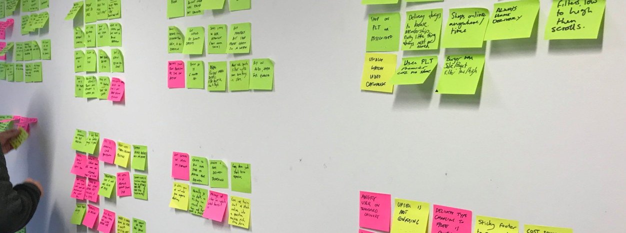
Researching into any existing calculators that helped customers and their pets allowed us to understand the types of metrics that were being utilised, the essential fields they were using and the type of results that were being communicated. Purina is a reputable brand, customers trust and believe in the brand so it was essential that the information that we communicated was clear and precise.
The results from the calculator was a possible opportunity to capture additional data from the customer or aid them in signing up for a newsletter or creating an account for their pet(s).
Insights
A lot of the existing pet calculators we researched didn’t have that personalised element to them – It was very much come to the site, input your detail and be given your information. This approach transactionally worked amazing however this is Purina.
Purina is known for its lovely brand personality towards pets this was an element that we needed to keep alive.
Cognitive walk throughs & journeys
Once I had a clear understanding of the required input for the calculator and the necessary information for the results page, I began exploring the current Purina website to identify potential areas for integrating the calculator. The goal was to seamlessly implement signposting into the users organic journey when they are search for such information as “How much to feed by puppy”. We didn’t want to intrude their current journey but guide them to the calculator.
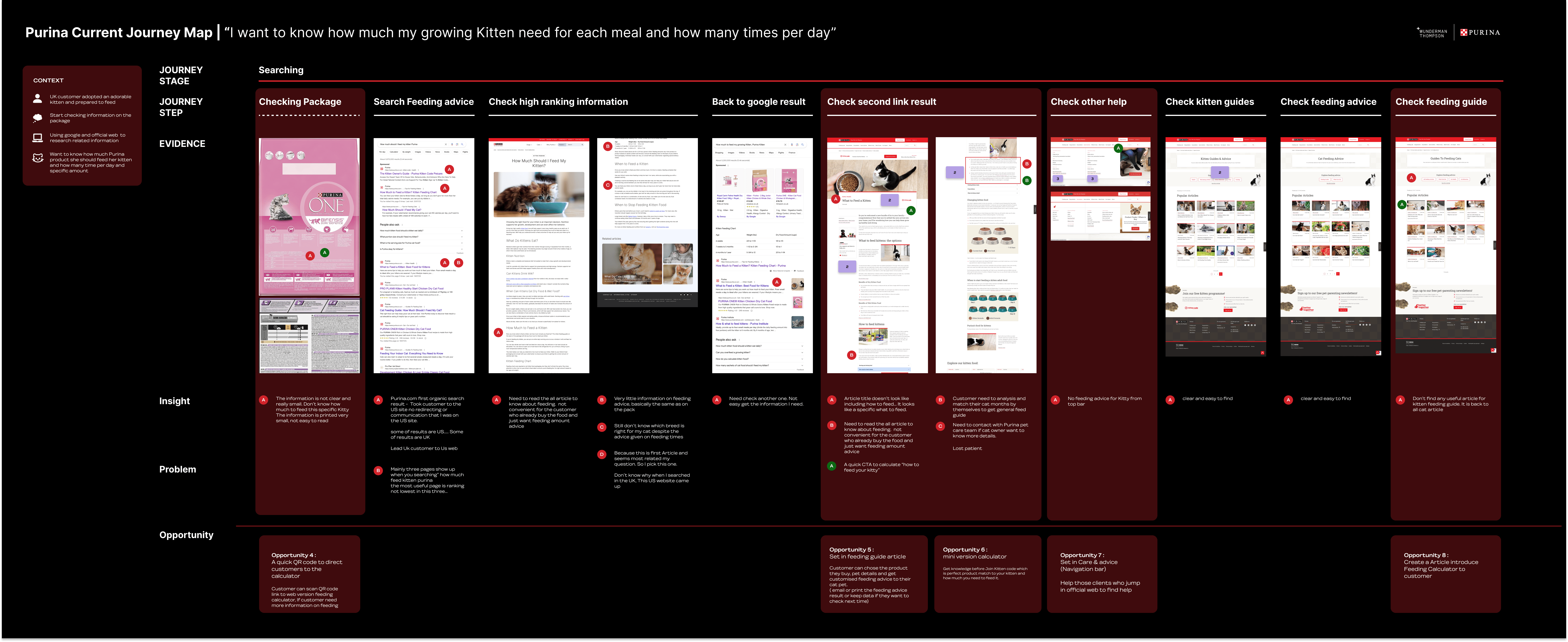
To demonstrate the integration possibilities within the Purina site, I created cognitive walk-throughs to simulate how a customer might navigate through the site with the goal of finding out how much food their growing kitten needs for each meal. For example, I conducted an organic keyword search and further explored social media and packaging QR codes.
Key findings
- Compared with competitors, Purina had limited and unclear information surrounding subject topics
- No clear navigation throughout the site or within the menu for such topics
- Kitten PDP communicating adult cat recommendations
- Key search terms were navigating customers to the US site without communication
Wireframes
The wireframes was where the real challenge kicked in – After going back and forth with the data team for the must have data points and the questions added in to give that personalised element, we had a total of 8 questions for the puppy journey and 5 questions for kittens. Our challenge was to ensure the customer easily worked through the questions without giving them much thought.
One of the biggest problems that needed to be tackled was how to ensure the user does not feel overwhelmed by the amount of fields that needed to be completed. For puppies the fields ranged from 10-13 as a couple of fields had dependancies, where at kittens were slightly easier with only 7 fields with no dependancies.
I explored the input fields to understand if any could be naturally categories as an option to reduce that cognitive overwhelm for the user.
- Would the calculator sit in page, open in an overlay, navigate to anther page?
- How do we make it feel like a personalised experience and bring a sense of character?
- How do we make the interaction simple, fun and easy to ensure the user doesn’t jump off?
- What do we do for the questions customer are going to need help on?
- An aim was to gather the customers email, how do we go about it without the user dropping off
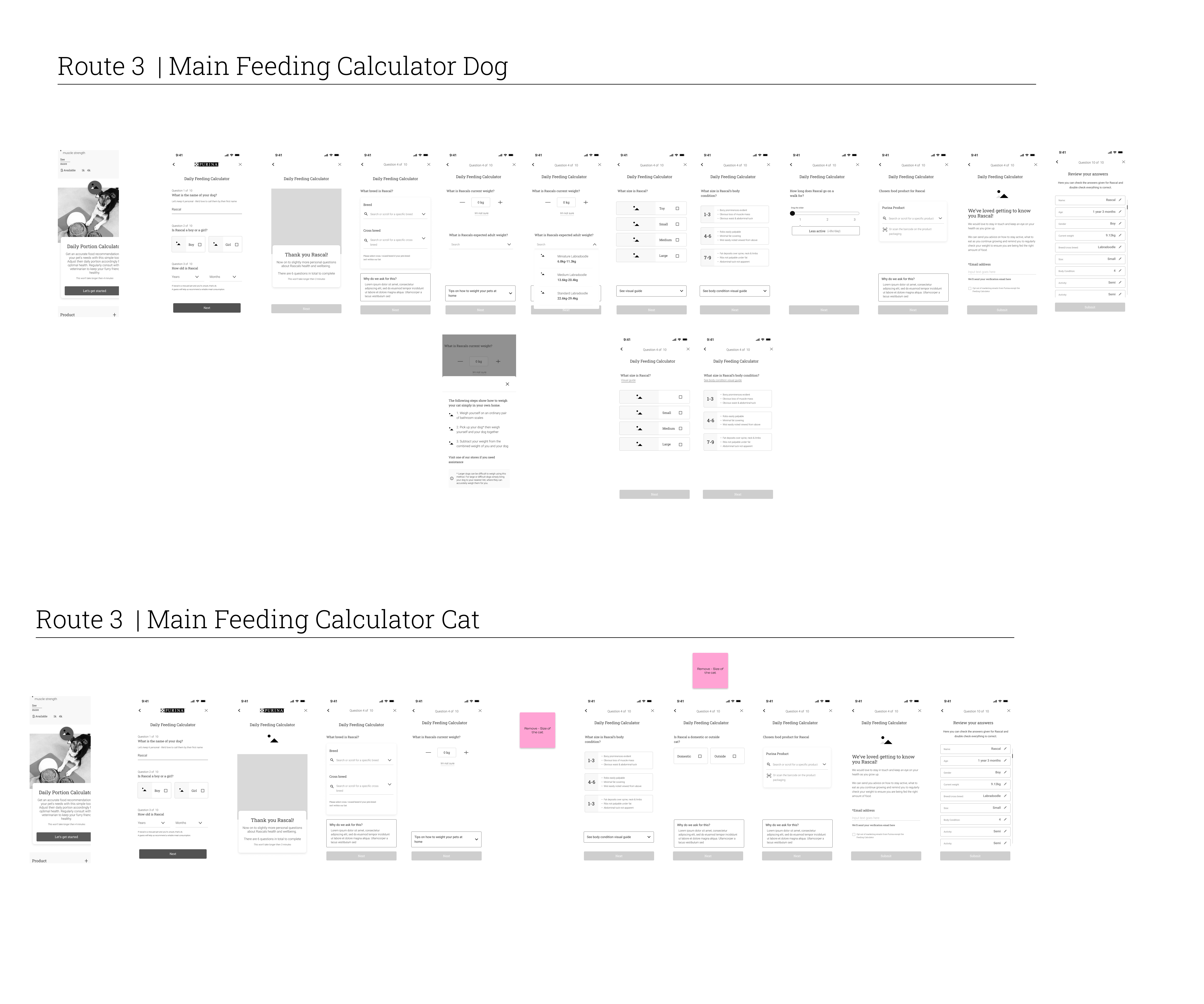
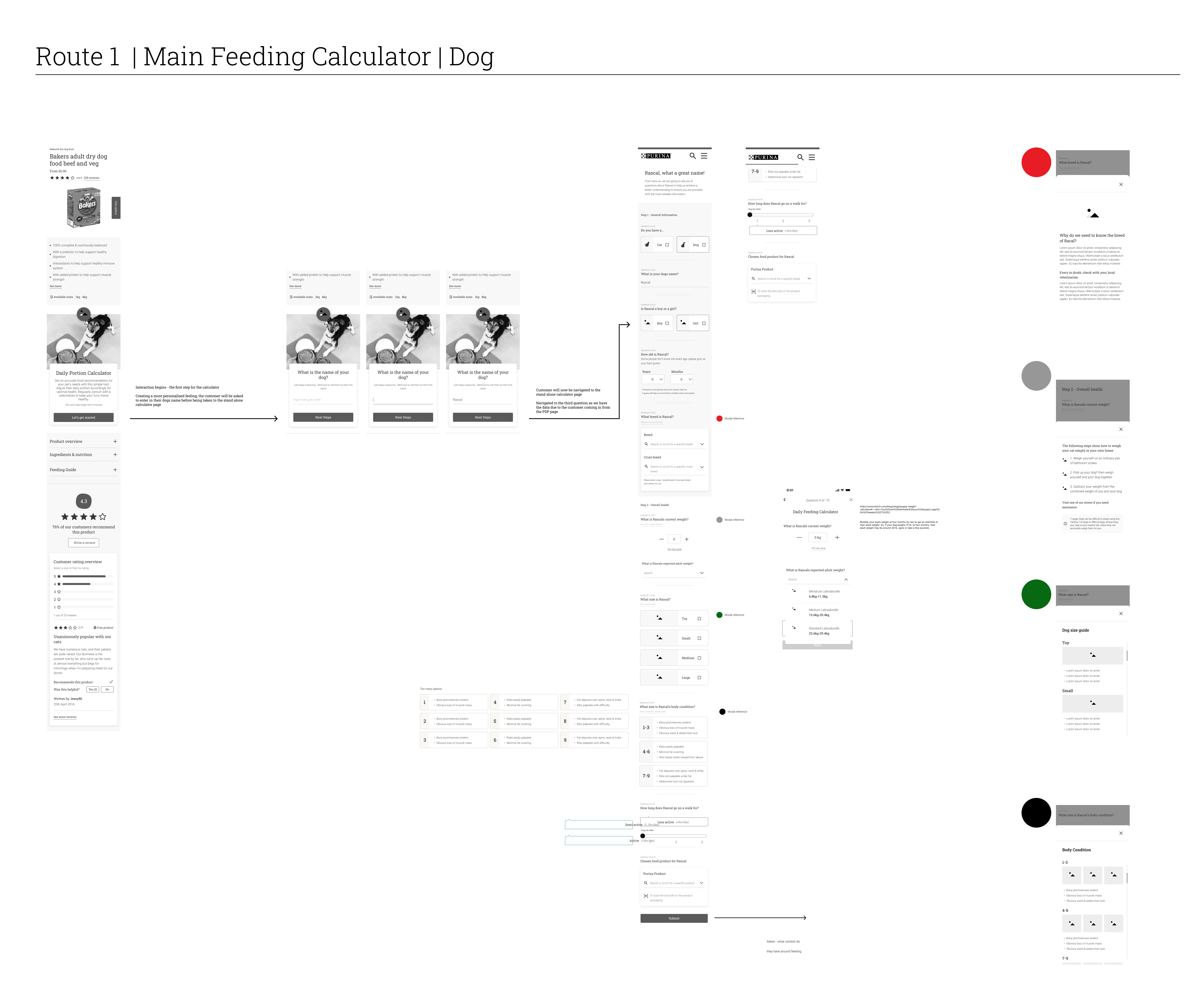
Limiting the overwhelming feeling of filling out multiple input fields was definitely a top priority. The input fields varied on factors such as if the pet was a dog or cat, if it was a pure breed or cross breed, this could push the input fields from 8-12 which could cause a significant drop off rate.
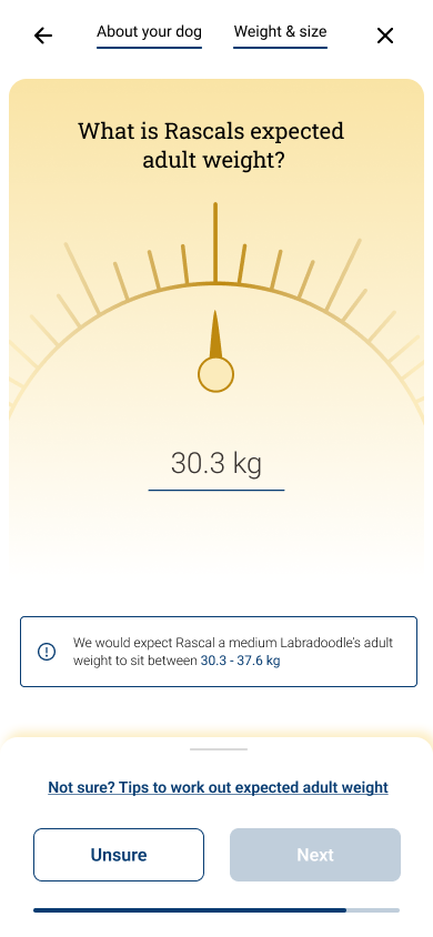
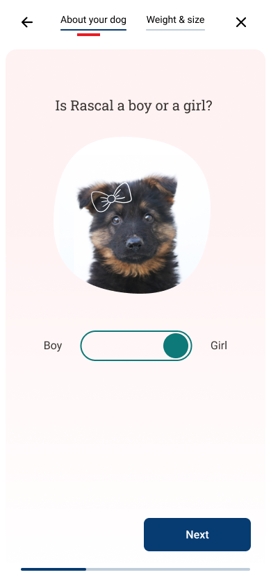
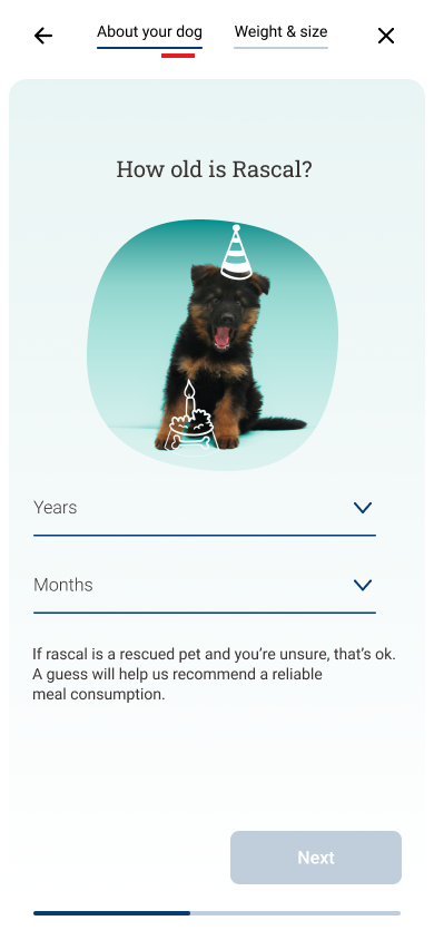
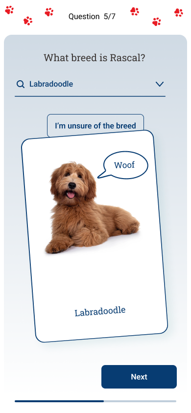
Playing around with ideas we began grouping questions together that were similar. Instead of making the customer swipe 8-12 times to go to the next question, we reduced it down to swipe maximum 4 times. Giving the allusions that there weren’t many questions and within a couple of swipes they were almost finished.
Personalisation
One of the biggest elements we wanted to bring to the feeding calculator was personalisation. The calculator needed to feel as if it was part of Purina’s brand not an added tool.
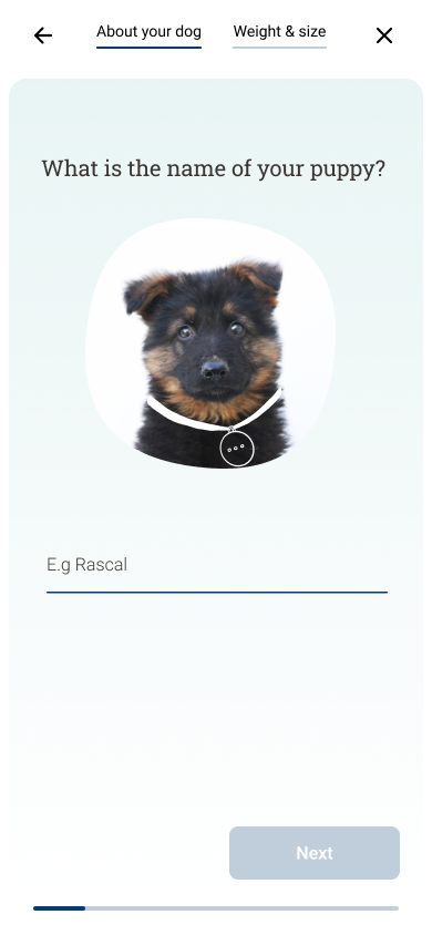
We approached this from the questions being asked – Currently we had looked into the questions that were an necessity to get reliable answers so it was a very functional tool – We wanted to play around with adding in questions such as- “What is your puppy’s name?” This way we could reference the pet when asking the rest of the questions – “When is Rascal’s birthday” over “ Age of puppy”. This would give an element of human touch and personalisation to the customer’s pet over generic questions.
Besides the content having a personalised feel, we want to see how we could bring the tool to life from an interaction perspective. Researching and playing around with small “pet-like” interactions to take the experience to the next level.
Key findings
- There is currently a gap in the market to create a tool that seamlessly educates customers about their pets and their eating habits.
- Currently, the majority of associated brands approach this issue by writing articles in an attempt to help customer understand the measurement. This directions leaves customers having to figure the measurements out
Data capture
One of Purina’s goals was to gain the customer’s email. What we didn’t want to do was entice users to fill out our calculator on the assumption they would be given valuable information and then force them to input their email to get said information. This was going to cause a high drop of rate.
Having looked at the type of customers that Purina have, they are loyalists, they care and want the best for their pets. Our assumption was if we provided such valuable information the customers would want to input their details. There would be additional incentives attached that would come when giving your email such as notifications for weight checks in and when the puppy or kitten food amount should increase.
Key findings
In order to effectively collect customer data, we realised that we needed to provide more than just the portion sizes and measurements for each customer’s pet. We began researching the challenges pet owners face when it comes to feeding their pets, and this led us to include additional information such as the monthly cost of feeding the pet and the duration the dog food they were inquiring about would last. This subtle approach is laying the groundwork for future tools that will enhance the overall customer experience.

The next steps
The next steps for this project is to work with the devs to implement the feeding calculator, QA test before it is put live and then leave the tool for for 3-6 months to see how customers interact, analyse the data, make any changes to improve the experience and then begin the next use case.
