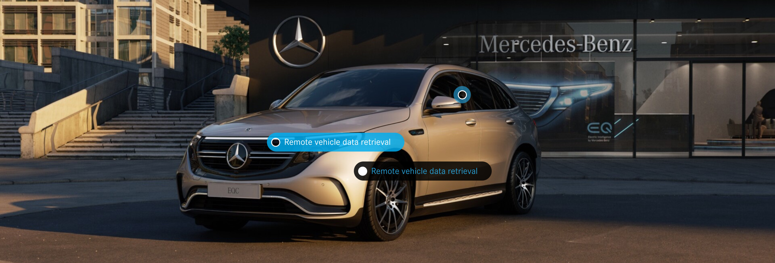
Mercedes Me POS
Overview
Mercedes-Benz offers an impressive range of luxury cars with unique features that can be accessed via the Mercedes Me app. The issue at hand was that very few customers understood these features, how they worked and how to incorporate them into their daily lives to make tasks easier.
We set out to address these misconceptions around the new features and their functionality through an interactive digital display. These digital experiences would be placed in a variety of pop up shops, retailers and Mercedes-Benz World around the country.
The Solution
Create a digital interactive POS display to support the release of the new features on the Mercedes-me connect app alongside creating awareness and educate our customers regarding older features. The digital experience will need to:
- Educate our customers on what features are available for their specific model of car.
- Allow customers to interact with the digital experience to simulate how certain app features work
- Offer a seamless transition for the user to download the app on the spot
The digital experience would need to entice both tech-savvy individuals as well as customers who are of an older age and may find new functionality intimidating.
MY ROLE
UX/UI Designer
User Research | Interaction | Visual Design | Prototyping & Testing | Presenting | User Persona’s
THE CLIENT
Mercedes-Benz
TOOLS
Sketch | Invision | Zeplin | Illustrator
Discover
Understanding the core of the problem.
Conducting a brainstorming workshop with the design director to uncover pains points felt by our customers, it was revealed that:
- Customers did not understand how to use or integrate the features into their daily lives. (23% of customers would either stop using the app or delete it within a week of downloading)
- Customers were unaware of what Mercedes App to download; there are multiple
- Many customers were unaware of additional costs with certain features, which left them feeling lied to
- Many customers did not understand how to begin using the features
We further analysed a range of comments left by our customers on the Apple App Store to understand their pain points further.
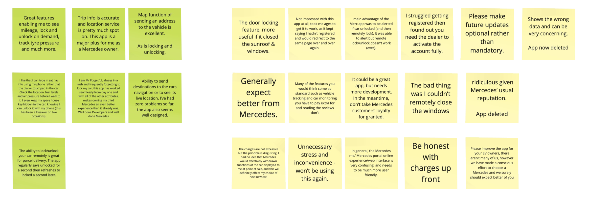
Mercedes Me – Research
Project vision
From these findings, we decided to identify key business goals:
- We want every customer interested in the Mercedes Me App to have a basic understanding of how each of our new and old features works.
- We want our customers to download the app directly from the digital experience
- We want every customer to feel confident, whether they are tech-savvy or not when interacting with the app
- We want customers to download the app and continually integrate it into their lives
Additionally, we conducted market research on our competitor’s apps to investigate the type of feedback they were receiving from their customers and take inspiration.
KEY FINDINGS:
Based on the research, it was revealed that there were commonalities in the project vision. We identified to following key goals we would focus on:
Which features cause the most confusion?
- Which feature was most popular?
- Which feature was most used?
- The least used features and why?
- If there are any features our customers would like added in future feature reveals
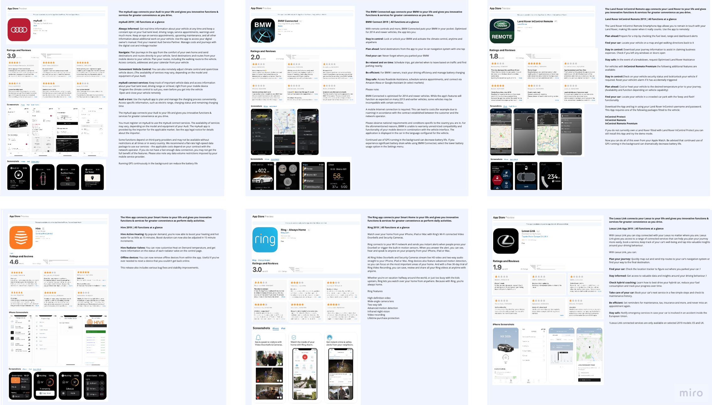
Mercedes Me – Research
Defining the Journey
The Mercedes Me interaction is a complex project. There is an enormous amount of vital information that we wanted to communicate. Using the information at hand we created a user flow with a reduced number of pages and reduced complexity to ensure customers of all technical abilities were able to interact with the interaction.
The interaction itself would need to be simple yet detailed in information but not too overwhelming for the customer.
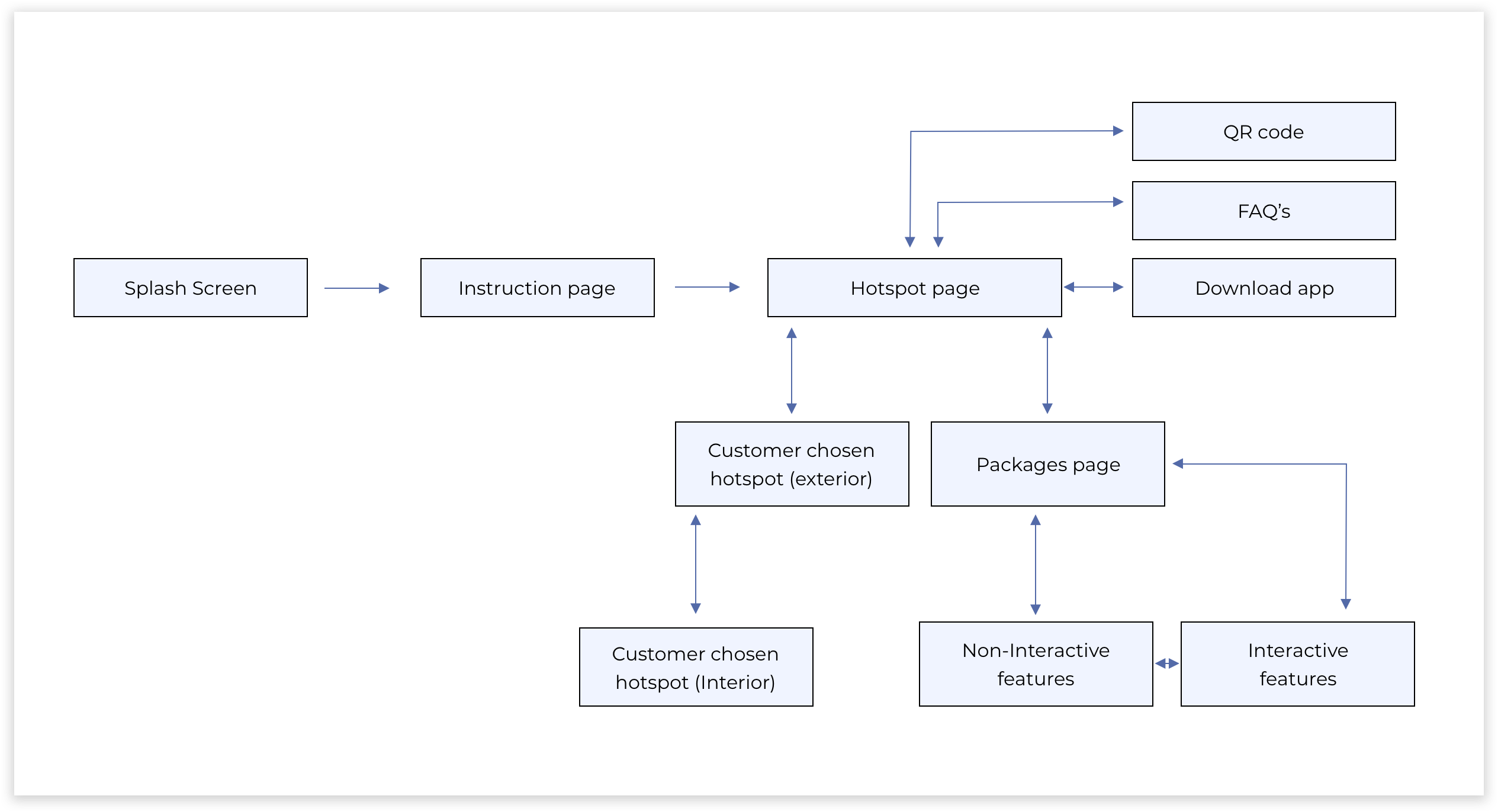
Mercedes Me: User Flow
Wireframes
Collaborating closely with the head of interactive development during the projects wireframe stage to ensure that everything being proposed from a code perspective would be technically possible.

Mercedes Me: Wireframes
Interactive development
The interactive developer’s collaboration throughout the process allowed me to see the wireframes in motion at a basic level. This, in turn, would always highlight any issues, whether that be navigation through the interaction, motion that didn’t feel right or design features that needed adapting.
Mercedes Me: Interaction development
Design
The Mercedes Me app already has brand and style guidelines; therefore, we need to keep the digital interaction on brand. Subtle visuals to ensure our customers are aware that this interaction was linked to the Mercedes Me app.
Working alongside the interactive developer allowed us to create an unforgettable touch experience that educated and informed our customers.
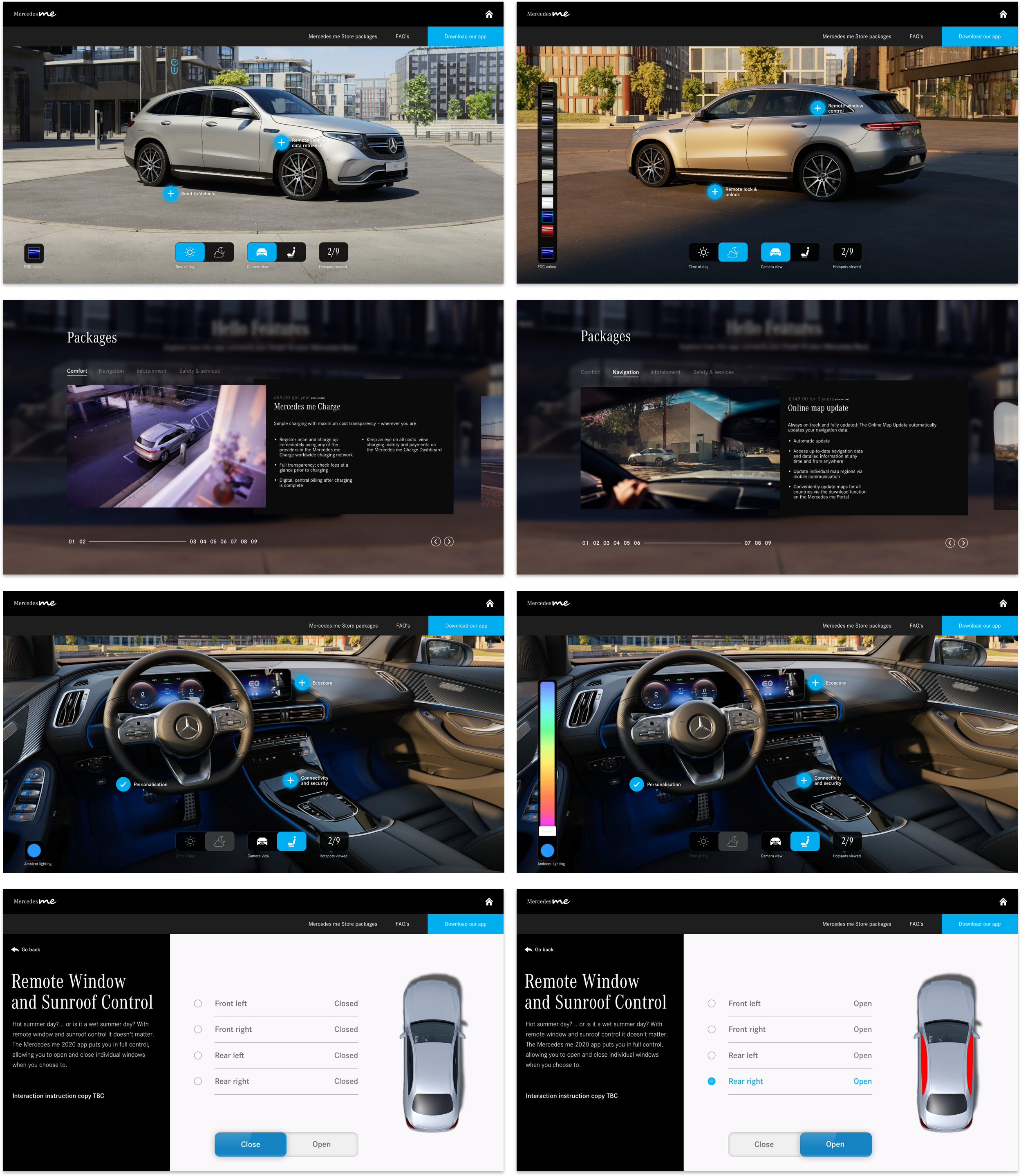
Mercedes Me: Design Overview
